
Decorating is not a look, it’s a point of view…
Look back at the avocado green of the ‘70s and you can see that colour trends come and go just like fashion – and can have a serious impact on home décor! The colours we choose to paint our walls are just as important as the surrounding furniture. Thanks to the stream of stunning interiors on social media and in glossy magazines there’s no shortage of inspiration. One item within your home can be the deciding factor of a decorating scheme; whether it be a cushion, a piece of artwork or a floor tile, it can give you a starting point for your décor.
There are no hard and fast rules when it comes to decorating. We all tend to gravitate towards different styles but there are a few pointers to bear in mind which will help: (1) the architectural elements of the room; (2) the light; and (3) your style.

(LEFT) Ceiling: Giallo. Walls: Giallo. Cupboard: Giallo. Left Wall: Bone China Blue – Faint; (RIGHT) Ceiling: Julie’s Dream. Left Wall: Masquerade – Mid. Right Wall: Masquerade. Panelling: Masquerade – Light
Colour can visually alter the proportions of a room and, costly extensions and architects aside, it can also be used to alter the shape of a room. When planning your colour scheme remember that a darker wall colour will bring the wall towards you, whereas a lighter colour creates the illusion that it’s further away. You can also prevent narrow hallways from appearing ‘tunnel-like’ by painting the end wall a darker shade than the side wall. The same principle works within a rectangular room that you’d like to make appear more square.
A few tips from Partners in Design can help make the decision making easier! A marvellous way to create light and space is to use the lightest colour on the largest surface area, such as the walls, and a darker tone on woodwork. Or there is great historic precedent for using one colour on both walls and woodwork and it is also popular in contemporary settings as it creates a strong, clean look. It generates a sense of calm in a room, as well as exaggerating it’s size, as there are no contrasts to draw the eye. Low ceiling? Using the same colour on the walls and ceiling will increase the illusion of height as the eye is drawn away from where the wall stops and the ceiling starts.
Neutrals are the perfect backdrop for decorating a room. Many people feel comfortable when surrounded by carefully balanced colours that create an understated environment, they don’t compete with each other thus making it easier on the eye. Choosing your perfect group of neutrals can really reflect you, your personality and your style and create a calm and tranquil atmosphere.
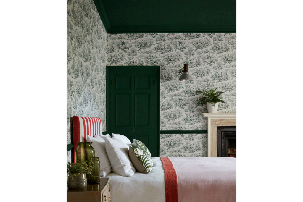
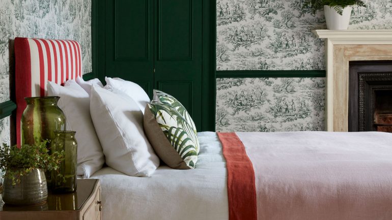
Lovers’ Toile – Puck (c.1950). Ceiling: Puck. Woodwork and Dado: Puck
The team at Partners in Design work hand in hand with our clients offering colour consultations that bring out the very best of your home. We offer fresh perspectives and exciting interior design. Stockists of The Little Greene paint company, an eco-friendly, family-run business cataloguing 300 years of paint and wallpaper, we are certain we can create the perfect colour scheme to make your house a home.
Images supplied by Little Greene
CONTACT
T. 01305 457 727
M. 07733 268 825
E. barbaraproctor@partners-in-design.co.uk
A. 3 Buttermarket, Poundbury, Dorchester, DT1 3AZ
Leave a Reply