
An alternate trend to the neutral colour palette has been gathering momentum – to embrace the darker, bolder hues and create a warm interesting interior that makes you feel snuggled and cocooned.
Successfully navigating the world of bright, vibrant and striking interior colours requires confidence. Take the plunge into something exciting, different and eye-catching. Partners in Design have a talented team experienced in using colour to highlight the beauty in a space, stockists of Little Greene paint we have an eco-friendly array of beautiful colours to work with.
The key to making dark colours work is by using luxe textures. Wool and velvet are good choices for upholstery and anything with a touch of sheen such as metallic fabrics or a statement wallpaper will lift the look, creating contrast and a sense of balance. Reflective surfaces such as mirrored surfaces work incredibly well – think antiqued glass tile panelled alcoves for example.
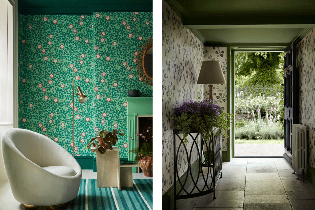
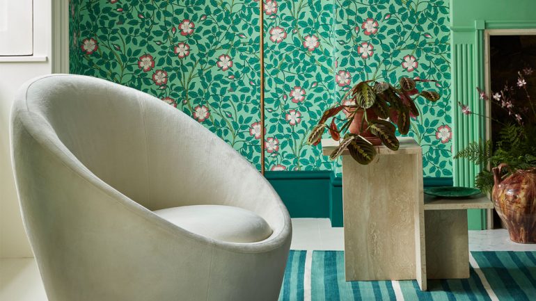
ABOVE (Left) Briar Rose – Green Verditer, Ceiling: Mid Azure Green, Fireplace: Green Verditer, Window Frame: Whitening, Skirting: Mid Azure Green. (Right) Wallpaper: Broadwick Street – Mono, Ceiling & Woodwork: Jewel Beetle
A useful tip for dark decorating is to paint the woodwork the same colour as the walls, along with the skirting. By painting the woodwork the same colour as the cabinets and walls, it recedes into the background to create a cohesive, sophisticated feel. This works especially well if you have a lot of cabinets or shelves as any contrasting woodwork could be visually jarring.
We all know nothing transforms a room faster than a few tins of paint and dark colours will deliver the most drama. There is an assumption that rooms decorated in dark colours can feel small and oppressive but when dark palettes are executed properly they are cosy, dramatic and full of life.
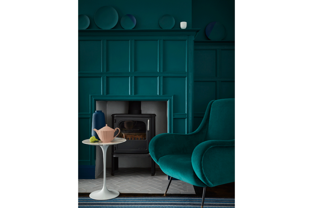
ABOVE Wall And Panelling: Mid Azure Green, Skirting: Royal Navy
Rooms that are public, see a lot of foot traffic, or are designated for socialising—like a sitting room, or kid’s playroom—can handle more colour on the walls. Try using the soothing palettes, like luxurious cream or soft grey hues for the rooms where a restful ambience is important: the bedroom or bathroom, for example.
For the less bold – focus on your front door. The front door is a relatively small part of your house, so if you paint it and end up hating it, changing it back won’t be a big deal. Plus, colourful doors have been around for ages so experimenting with yours can be a restrained first step into bold shades.
Go on, make a statement with colour!
Photography credit: Little Greene Paint Company
CONTACT
T. 01305 457 727
M. 07733 268 825
E. barbaraproctor@partners-in-design.co.uk
SHOWROOM
3 Buttermarket, Poundbury, Dorchester, DT1 3AZ
Leave a Reply